The 6 Ugliest Fonts in Web Design History
Remember that most fonts are designed to make communication easier. "Communication" can mean many thingsâ??for instance, if you're writing a book, you want the font to be unassuming and easy for the eye to flow from letter to letter and word to word. If you're printing a "Happy Halloween" banner, you can get a little creepier with the design because that will help communicate the mood.
Here are some of the ugliest fonts in web design history and what they were (hopefully) going for.
Comic Sans
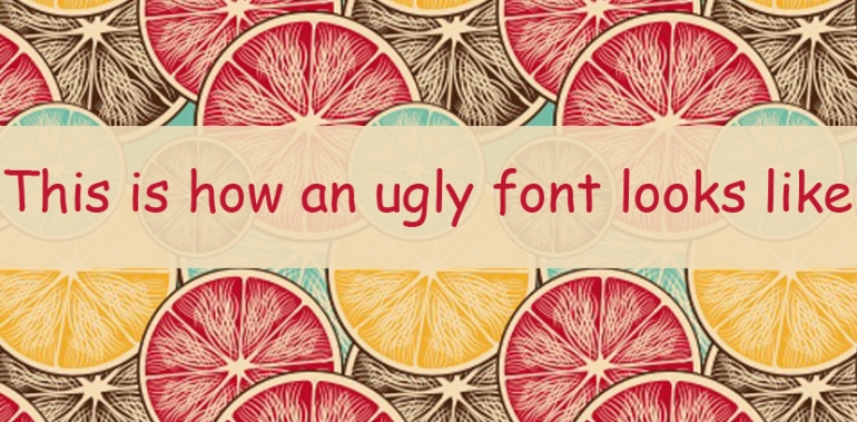
Let's get this one out of the way. Designed by Vincent Connare in 1994 by Microsoft, it's a sans-serif casual font that was supposed to look like old school comic book characters. However, many experts agree that it's the use of the font in inappropriate contexts that's really garnered so much criticism. It may look perfectly fine advertising a superhero-themed party for kids, but it has no place in a business setting.
Ravie
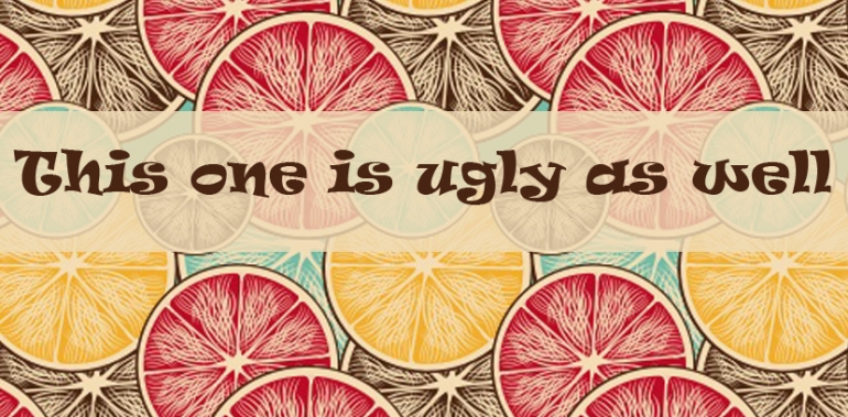
This "gem" was designed by Ken O'Brien in 1993 while he was studying at the Art Center in California. It was supposed to be funky and full of energy, perfect for the next "rave." However, few underground dance parties actually used this font since it's more of a caricature of what a party font should be. Hopefully O'Brien learned quite a bit more before graduating and toned down the font fiesta.
Broadway
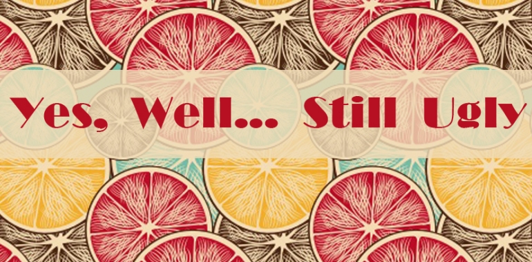
To be fair, the use of the classic "Broadway" font in places like actual theater marquees is perfectly fine and a charming throwback to the golden era of cinema and theater. It's an art deco typeface that was designed in 1927 by Morris Fuller Bentonin for ATF, and was sadly discontinued (by ATF) in 1954, then revived for the digital era in the 90s. On the digital screen, it just looks cheesy and takes away from the beauty is bolsters when larger than life on a metro street.
Algerian
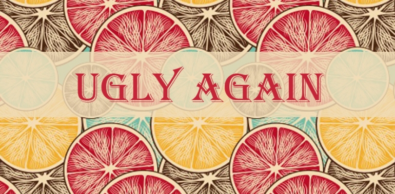
This decorative font features a heavy serif design and is basically a cheap replica of the 19th century Keystone Foundry Glyphic. A property of Linotype, part of the International Typeface Company, today's offerings come in classic or condensed, although neither translate well to digital screens. Originally designed for woodcut types, the latest rendition was created by Alan Meeks in 1988. Simply put, it's too heavy and intricate to be offered in something like Word.
Brush Script MT
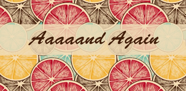
In the aptly shortened BS' defence, the font didn't bid to become the go-to font for tattoo scripts. In actuality, it's not an "ugly" font on its own by the heavy use of it for tramp stamps and cheap tattoos can't be denied. It's heavy, informal, and was meant to look like it was created with brush strokes given the cursive nature. A better use of this font, and to see it in a fresh light, is to use only the capital letters which are actually rather lovely and not demonstrative of a lazy ink job.
Chiller
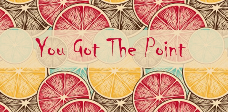
An Andrew Smith product, Chiller may have been handcrafted by one of the most revered of British designers, but it's a niche choice that can easily get out of controlled. Described as "alarming" and "undisciplined," it's certainly both of those and requires the right environment to thrive. It looks like it was created with paint splatters, is purposefully reckless, but yet still legible. It's name is spot on, which means it's a good choice for a Halloween party invitation but not much else (however, it might ward off grazers from swiping your lunch if there's an attached "hands off" note in Chiller).
Of course, ugly or gorgeous fonts are all relative. With the right marketing angle, you might be able to use nearly any font well.

