|
INTERFACE How a Simple Layout Can Be Mixed 'n' Matched with Patterns, Photos and Backgrounds by Collis Ta'eed - 1 Dec 2008
It's pretty amazing how much colour and background can change the look and feel of a website. In this tutorial we're going to put together a quick, simple but effective layout and then create variations using backgrounds, photos and patterns. We'll also look at how to make seamless tiled backgrounds out of a photo, methods for ending a single photo and simple ways to create pixel patterns. In short it's a jam packed tutorial!
Step 1 - Creating the Basic Layout
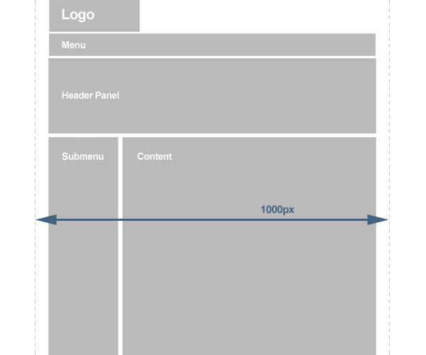
So our first task is to design a layout for our page. We're not going to do anything too fancy because the tutorial is about backgrounds more than layouts. Still it should look good and be an actual workable layout. So in the image above you can see my plan of rough components of the page. I've planned in a menu and submenu, a panel to introduce the section and a content area. I've also planned that it should be less than 1000px so that when a person on a small screen views the site they still see the background properly (since that is going to be a big feature of the design). Now I should point out in reality I didn't actually draw out this set of boxes quite like this. It was more like just muddling around until I thought "oooh that's a nice layout". But for the purposes of this tutorial it makes better sense to explain it this way!
Step 2 - Fleshing it out
So that layout is our bones, now we need to flesh it out with some dummy content and a colour scheme.
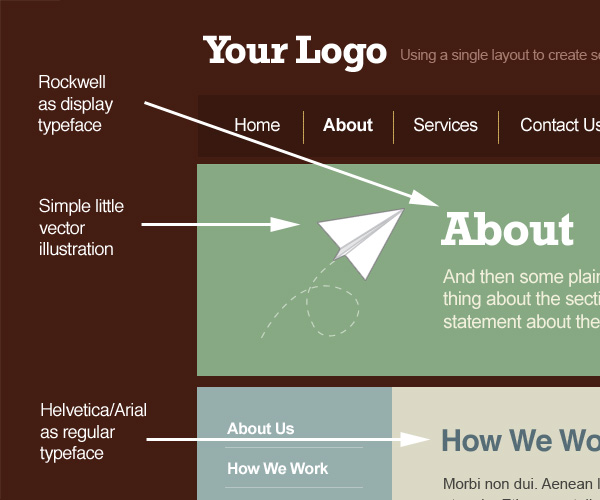
As you can see I haven't done anything really amazing here, just placed the elements on the page fairly neatly and evenly. So note that spacing. In the image I've tried to show how different elements line up (yellow lines), how spacing is roughly even vertically and horizontally as well as above and below elements. Note that these are just rough guides and I actually just work by eye until things look right. But if you are unsure of spacing, doing things fairly evenly is not a bad place to start. As you get more comfortable with spacing you can vary things up and play with uneven balances.
In the image above you can see I have chosen a main display typeface called Rockwell that we'll use in the heading panel to give the page a bit of character. If I were building this site that might be an image or inserted using sIFR. The rest of the text is Helvetica and Arial which of course is suited to HTML use. Also I threw in a vector illustration of a paper plane that I drew years ago and sell as stock. Of course in a real project, this image would be something to do with the site instead of just randomly thrown in as I have here.
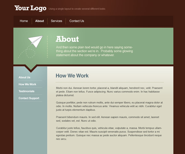
Finally I've used a warm, earthy tones colour palette. I'm actually a bit of a fan of beige and earth colours and you'll find I use them a lot. I think they go a long way to making websites look friendlier and more approachable. So the page is looking OK, but there's nothing very memorable about it yet and it's a bit basic. In the next step we'll add some polish.
Step 3 - Polishing and Adding Some Style
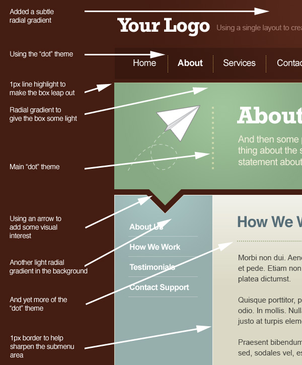
OK so here you can see the exact same layout but I've polished it up and added two visual elements to give it some style. The first element is the arrow cut out of the side menu. This makes the middle panel look like a kind of overgrown speech bubble. The second visual that you'll see when you look close up is a sort of dot theme. So in all we've used three visual elements to give the page some style: an illustration, an interesting grid-breaking shape, and a subtle theme based on a simple shape. Later we'll add a fourth visual element - a background - to finish off the site's style.
In the image above I've pointed out all the bits of polishing that I added. It's all just little highlights and graduations in colour, dots, and of course the cut out arrow. So with that we have our basic layout! |
|||||||