
Color theory is a vast and complicated sphere of knowledge. It consists of different scientific elements, such as: optics, spectroscopy, human anatomy and physiology, psychology, art history and theory, philosophy, ethics, architecture theory, design and many other applied sciences. In this article we will show only the schemes of harmonic color combinations and the examples of their usage by a bunch of talented vector artists.
How are Colors Created?
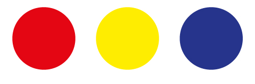
Let's first understand how the varieties of all colors are formed. All the colors can be received from the combination of primary colors, which are red, yellow and blue. These colors differ from the others by the fact that they cannot be created by mixing the other colors.
In order to make secondary colors you should mix the primary ones. By mixing red with yellow we get orange, and by mixing red with blue you get a violet color. Blue together with yellow turns into green.

For creating tertiary colors you should mix the primary color with the neighboring secondary color. It means that there are six tertiary colors (two colors from each primary color). As a rule colors are placed in a spectrum and it is called a color wheel.

The method of making your own color palette with the help of Color Blending Methods is described in a wonderful tutorial How to Create a Wide Range of Custom Color Swatches in Illustrator. One of the methods is illustrated in the picture below. You can use these colors in your work after downloading the source file.

The figures in the picture show that 1 - is for primary colors, 2 - is for secondary and 3 - is for tertiary colors. Colors that have figures are called the pure colors; they have no black and white impurity. For getting colors in digital art such color mode as RGB, CMYK, LAB and HSB can be used. You can read everything about their quantities and application in the article An Introduction to Illustrator's Color Tools.
The Color Scheme
There are different methods of getting harmonic color combinations. Let's discuss harmonic color schemes and examples of their application in vector art. These color schemes are usually called the basic ones.
Monochromatic Color Scheme
The variations of brightness and intensity of one color is used in this scheme. This scheme is simple and elegant, colors are soothing. The basic colors can be combined with neutral ones such as white, black and gray to contrast the elements of a composition.
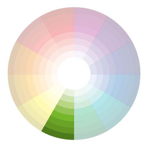
Golden Time, by Guilherme Marconi

The Curse of the Hamster, by Zutto

Analogous Color Scheme
In this scheme we use colors that are placed near each other in the color spectrum. This kind of scheme is often used for the creation of peaceful and comfortable designs. An analogous color scheme is often met in nature.

One color is usually used as the basic one, the second color is as accompanied, the third is used as an accent for the contrast creation, it may be white, black or gray.
Bring Peace to Midnight, by lostsoulx44

phil's_lion, by Melelel

Complementary Color Scheme
Colors that are opposite each other in a color spectrum are called complementary colors (for example red and green).
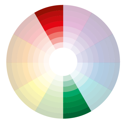
Such color combinations creates a high level of contrast in combination. But we should be careful with such a combination and use it only if we want to select something. Complementary colors are really bad for text.
Fruits, by Konstantin Shalev

TULIP, by gartier

Split Complementary Color Scheme
This scheme is the variation of complementary color scheme. It uses a color and two colors adjacent to its complementary. Only right or left colors from a complementary color are used. This provides high contrast without the strong tension of the complementary scheme. The split complementary scheme is harder to balance than monochromatic and analogous color scheme. One warm concentrated color and a number of cold colors are usually used.

The Daughter of Poseidon, by zanthia

OJ, by Ikue

Triadic Color Scheme
Three colors that are equally placed in a color spectrum are used in this scheme. This scheme gives a strong visual contrast with harmony and color richness. Colors in this scheme are more balanced than in a complementary color scheme. As a rule one color in a composition is chosen as basic.
Bananas-and-Tomatoes, by rosesaregreen

Summer, by Zzanthia

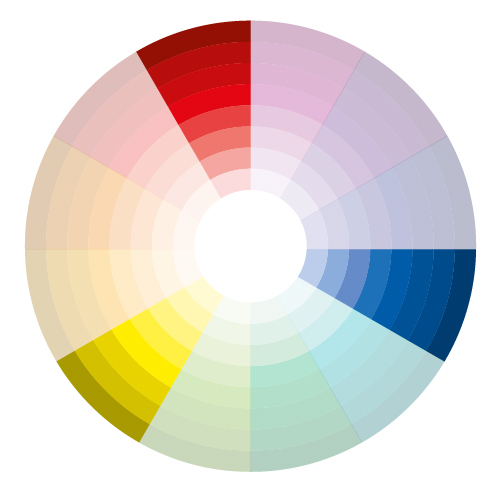
Tetradic (Double Complementary) Color Scheme
This scheme is the richest among all the schemes because four colors which are placed in complementary pairs are used. It is difficult to achieve harmony in this scheme. If four colors are used in the same quantity the composition might appear to be unbalanced. That's why we should choose one color which will be dominant.

Time, by LimKis

Fruit Fly, by ArtSerenity

Adobe Illustrator allows you to use basic color schemes. To do this, after selecting the color you should open the tab Harmony Rules in the Color Guide palette. Select the desired color scheme and choose color from a number of proposed colors.

Except the basic colors, there are lots of other color schemes that are based on associations with human reception. These are the main schemes.
Hot Colors
The tones of red are considered to be hot, which are associated with the fire. Hot colors seem to move beyond the composition flatness and attract attention. That's why they are often used in posters, ads, road signs. Hot colors possess the strength and aggressiveness.

jellyfish,by LimKis

Nissan Skyline GT-R Vector, by hoshiboshi

Cold Colors
Tones of blue are considered to be cold colors. Cold colors remind us of ice and snow. When cold and hot colors are placed nearby it seems as if they are vibrating.

Lost in the Space, by javieralcalde

Life, by Surround

Warm Colors
All colors that contain red seem to be warm. Red-orange, orange and yellow-orange are supposed to be warm colors. Warm colors are comfortable, impulsive and friendly.

Autumn Girl, by mashi

Sunset Room, by SteveNewport

Cool Colors
The basic tone of cool colors is blue. If we add yellow to cool colors we receive yellow-green, green and green-blue colors. Such tones relax, refresh, and give a feeling of depth and comfort.

Frozen in Time, by hitman101

The Martini Drink - Gmesh, by enikOne

Light Colors
These colors have got lots of white color. As a rule such colors are called pastels. It seems that they are transparent and weightless. The more light the color is, the less is the number of combination variations with it. The light colors are open and give the feeling of reconciliation and quietness.

Glossy Roseate, by afordite

I'll wait for you..., by NaBHaN

Dark Colors
The dark colors are those colors that are mixed with black. They look as if they close the space, make it less. Dark colors are associated with autumn and winter, which are dark seasons. The combination of light and dark colors creates the feeling of drama.

Pirate, by LimKis

Dark elf with BFS, by sygnin


