
The Ultimate Guide to eCommerce Design Trends 2016
It's no secret eCommerce is huge business these days, and this industry continues to grow. Of course, eCommerce is highly dependant on user expectations, trends and new technologies. If your eCommerce website is poorly designed and doesn't correspond with the customer's idea of how it's supposed to look and work, then your business is doomed.
Naturally, the biggest trend in eCommerce design is seamless user experience, and every other trend and fad really stems from that one.
Responsiveness
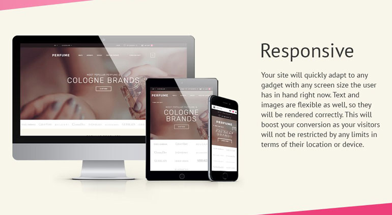
Ever since Google changed the algorithm to eliminate non-mobile friendly websites from the mobile search results, responsiveness has become the biggest trend. This is especially true for eCommerce, the studies show that mobile eCommerce in US had about 30% of the market in 2015 and much more worldwide. The numbers continue to grow rapidly. In this context responsive approach has become the most efficient solution.
Material Design
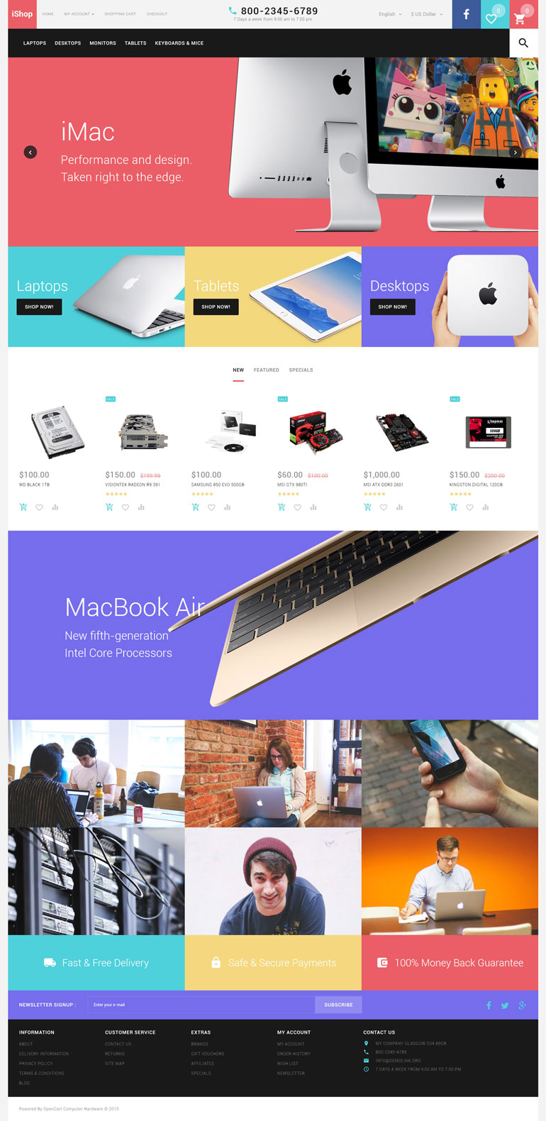
Google's Material Design was probably the biggest trend in web design in 2015 and most probably will continue to stay that during 2016. eCommerce was a bit slower in embracing Material in 2015, now though I'm pretty sure we will see much more of Material styled online stores. Bold typography and vibrant colors, the distinctive features of Material, are perfect for online commerce after all.
Card-like Layouts
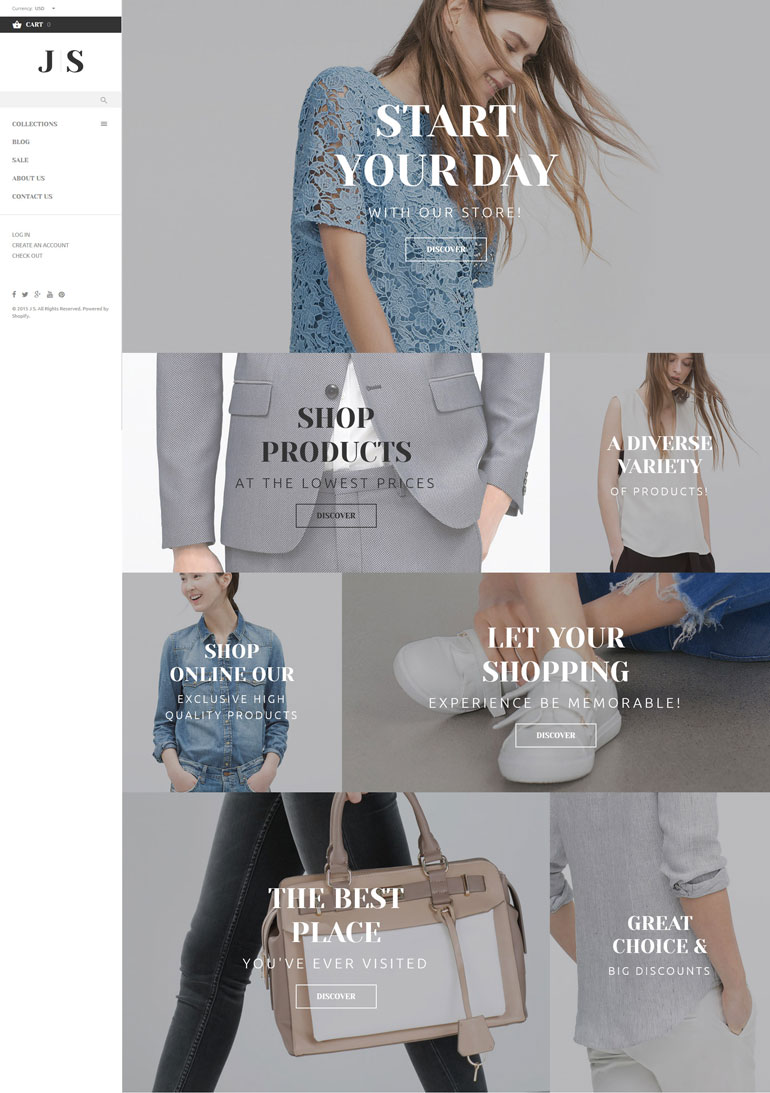
Card layouts are a part of Material design and therefore its popularity was increasing recently.We are sure to see more of card-like layouts in online stores this year.Not only because they are a part of Material and very popular overall, but because of their exceptional user friendliness. And you remember that user experience is the biggest trend of them all. Besides, card layouts work great with responsive.
Video
With the development of technology,we can now offer full view of the products in engaging videos without damaging the overall user experience with long load etc.
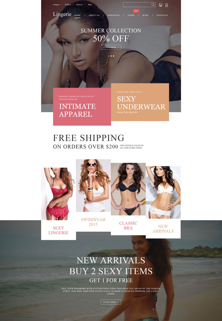
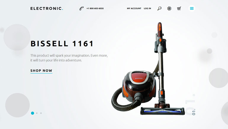
Huge Photos
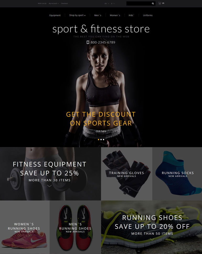
Big photos of the products, full-page photo backgrounds, these things are meant to create an engaging experience for the customer.Remember,you have to made the product attractive to customer and the feel they want to buy it without physically seen or touched,high quality vibrant images are your best option.
Hamburger menu
In accordance with the all-encompassing tendency to unify user experience throughout the platforms and devices hamburger menu quietly warmed its way from apps-only to desktop design and in 2015 created quite a buzz in the industry. Whether you like it or not, hamburger and its variations seamlessly clean up all the unnecessary clutter and improve user experience greatly, besides customers are now expecting to see them and you can not afford to deny your customers, not here, not this.
