A Short Guide to Building Fast Websites
When you're first starting out in web design, website speed can seem like someone else's problem. At least, when I was a newbie, it seemed that way.
I started every design on a blank Photoshop canvas, after all. No planning, no wireframes. I usually didn't even plan out how many pages I was going to have, or what was going to be on them. I was just "making websites", mostly for fun; because that's how I decided to spend my teenage years.
I thought that I could figure out how to optimize for speed once I figured out how to build websites in the first place. After all, speed was only an issue if my sites were truly massive, and people were still on dial-up, right?
That's a rhetorical question.
What I had to learn the hard way is that you should, ideally, begin as you mean to go on. There are some things you just have to prioritize first, and that means building websites for speed from the outset.
Now what am I talking about when I say "speed"? How fast it loads in the browser? How fast it runs? Yes. I am talking about both; because there is a lot of overlap between those two kinds of website speed.
You need to consider both. Lots of people still have pretty slow Internet access. 3G is not great, and mobile users have those pesky data caps. Also, there are possibly millions of mobile devices out there with low-end processors.
While I may provide a few technical tips and tricks in this article, the most important thing you can adopt is the mindset. Speed means conversions, sales, and people coming back to your website for more of your content. A slow website means people walking away for something that doesn't test their patience nearly as much. And sites can feel slow, even when they load fast.
This is the Internet. You have competition.
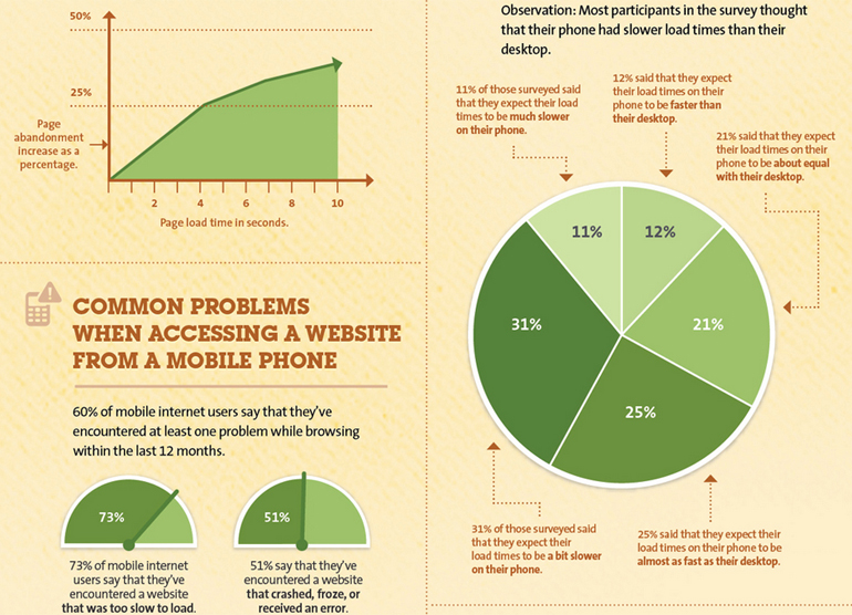
Here's an infographic, if you want a more visual explanation of how website speed affects your bottom line.
 Do follow the link to view the whole infographic
Take it from the top
You should begin your speed optimization where you should begin every other part of the design process: with the content. Unless all of your visitors are fellow web designers, chances are they don't care much about your sites design, so long as they can get to the content.
If the content itself is slowing down your site, no amount of optimizing the site's design will fix it.
Content can slow you down in a couple of big ways:
Massive images
It's becoming apparent that big images tend to sell better. And that's great. But please use those massive images sparingly, make sure they're properly compressed, or better yet, use SVG.
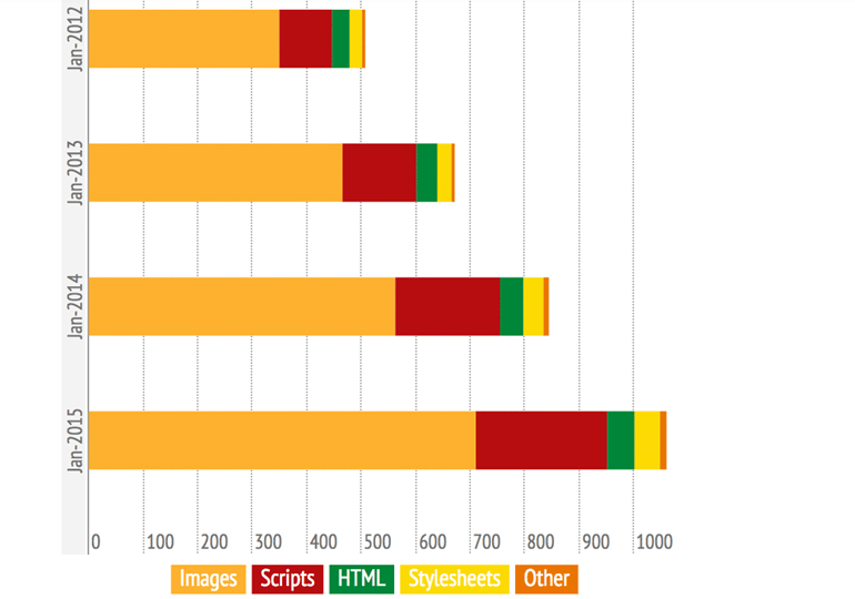
If you take a look at this data, you'll see that the average page size served to mobile devices (the ones with typically slower speeds and capped data plans) is fast approaching 1MB, and images are half the problem.
You can have the best of both worlds, in some ways. After all, it's getting easier to implement responsive images. People browsing on their desktop are more likely to have Internet fast enough to deal with the larger images, after all.
Ads and other third-party content
Yes, ads count as content, especially when they're mixed in with the body of an article. Worse, sometimes ad networks are really, really slow. I can't count the number of times I've been annoyed to find that only part of the page has loaded, and the browser is waiting for the ad network before it loads the rest.
Double-check your ads if you're going to have any, see how they're to be implemented, and make sure that can't happen. The same goes for any other content you're pulling in from any third-party servers. Pulling in RSS feeds, social media feeds, and the like can slow your site down even more, if you're not careful.
When the design itself is slow
Of course, it all works in reverse, too. Many a site with light, simple content like text and a couple of small images has been weighed down by poorly-planned design and bad code.
This is, in part, because people feel the need to make their sites as fancy as possible. I understand that urge; but the days of Flash have come and (mostly) gone for a reason. Replacing Flash with HTML5, CSS3, and JavaScript should not be your goal.
Your users don't need things to bounce around the screen. They need to get to the information you offer, or the product you're selling.
The fancy stuff often slows things down
Your website doesn't need parallax effects, a bunch of animation, or shiny whatsits to be effective. Now, I'm not saying that you should simply leave it as black text on a white background with no layout. I'm saying that each and every stylistic addition needs to be weighed against the user experience.
When you do add animation and flashy stuff to a site, ask yourself if you just need it for one or two things, or if you're going to need something more advanced. Chances are good that if you're not making an actual app, you don't need something as advanced as, for example, jQuery. This is especially true of small-to-medium sized sites.
It's not just the byte size either. I've seen animations on web pages slow down my whole gaming PC, which is not cool. Now imagine someone trying to browse that site on a low-end smartphone or tablet. Imagine the frustration.
Speaking of too much code
This brings me to the subject of HTML and CSS frameworks. Chances are that you don't need whole massive frameworks like Bootstrap or Foundation to make a simple site. It might cut down on the front-end development time a bit; but it might not be worth the extra loading time.
If you're going to use a framework, at least customize it, and take out the stuff you don't need. Most of the bigger HTML/CSS frameworks offer easy ways to do this.
About those images again...
No, not the massive ones. We talked about those. Now's where we look at the details. Is your site still using raster images for background colors, gradients, shadows, icons, and that sort of thing? It shouldn't be.
If it can be done with HTML, CSS, and SVG, then it should be. It might be more code, but code is still usually lighter than .jpeg files, and even many .png files.
So my site's faster now, right?
Well, there's a lot more to learn, especially if you're using a CMS like WordPress, or any sort of complex hosting setup. This advice will just get you started as you build your first websites... but hey, learning new stuff is the fun part!


